Colour in Brand Strategy: Colour Psychology and How it Influences Branding
Yellow arches. A red can of cola. A bird shell egg blue jewellery box. The colours alone are enough to make you picture the brand – McDonalds, Coca Cola and Tiffany’s.
Colour and the psychology or science behind it is an expansive subject with a depth which extends well beyond the aesthetics of just ‘good design’ and subjective preferences. The context of its usage together with personal and cultural associations has significant impact in terms of meaning and perceptions, both consciously and subconsciously, together with usability and purchasing preferences. Consequently the psychology of colour and how we consider its use has a huge impact on all the work we do with our clients and their brands both in terms of brand profiling and brand design. The following four key tips will give you some insights into how colour works, what to use and what to avoid in relation to your brand.

There are many studies on the use of colour all of which agree, colour greatly influences human emotion and behaviour. Colours have a powerful and unquestionable effect on branding. The right colours can distinguish your brand, attract customers and create strong brand-based loyalty, while the wrong colours can sink you in the marketplace.
In order to establish a comprehensive and effective brand identity, you must choose your colours wisely – considering not only what colours might attract the right attention within your category – while also giving your brand distinction, and for example standout on retail shelves, but how your brand colour schemes will affect customer perceptions, evoke certain moods and grab attention. Colour psychology is particularly critical in the retail environment and can make or break customer purchasing decisions.
Why Colours Matter
For your customers, colour is a powerful motivator in recognition and purchasing decisions. According to recent statistics posted by analytics company KISSmetrics:
85% of shoppers cite colour as their primary reason for buying a particular product
93% of shoppers consider visual appearance over all other factors while shopping
Colour increases brand recognition by 80%

Image via www.kissmetrics.com
The psychological reasons for the strong effects of colour are numerous. Visual perception is the primary sense people rely on – reacting to colours is hardwired into our brains. Identifying a colour triggers a diverse series of reactions that effect moods and emotions on a subconscious level…in short, colour makes people feel something and impacts their behaviour.

Colour is hands-down the strongest and most convincing factor of visual appeal. When you choose the right colours and ensure that your brand colour scheme is carried out consistently and coherently across your brand identity, logo, packaging design and all your brand collateral, you are creating powerful brand recognition and fostering customer loyalty that will pay off with increased profits.
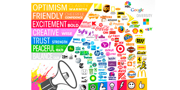
The Meanings of Colours
Different colours evoke certain moods and emotions, and convey a particular sense of expectation. The meanings of colours often vary depending on a number of factors, including culture, gender, age, context and individual experiences, but the basic perceptions of colour remain fairly consistent.
Red is Passionate and Powerful:
A bold colour that stands out, red can be used to signify power or passion, and make a strong statement. Red evokes a visceral response, causing faster breathing and an increased heart rate. The colour red can be energetic, aggressive, provocative, or even dangerous – but it is always attention-grabbing.
Blue is Cool and Confident:
42% of people claim blue as their favourite colour, and that enthusiasm is reflected in the many companies that use blue in their branding. Blue colours are seen as calming, cool, serene, and stable – which is the reason for its heavy use in brands where security is a top concern, like banking and social media.
Green is Natural, Youthful and Plentiful:
A color associated with both money and the environment, green can point to health, serenity, and freshness. The meaning of green often depends on the shade used – while lighter greens are calming, deeper greens are associated with wealth or prestige.
Yellow is Cheerful and Optimistic:
Universally associated with the sun, yellow is the most visible and noticeable colour, seen by the eye before any other. Bright or warm yellows evoke feelings of happiness, optimism, and friendliness.
Purple is Luxurious and Creative:
The colour of artists and royalty, purple can evoke feelings of quality and decadence, mystery, or sophistication. The choice of shade and hue when using purple is of vital importance – light purple can be calming and whimsical, and deep purple can be luxurious, certain shades are viewed as garish or tacky.

Orange is Fun and Lively:
Ranging from warm and intimate to playful and exuberant, orange can represent comfort, excitement, or even upscale quality, depending on the shade used. Light orange and peach tones are used in high-end branding, bright orange can be effective for entertainment brands, and muted orange is a favourite for restaurants because of its association with food and warmth. However, in some cases orange can come across as frivolous or cheap.
Pink is Creative and Feminine:
The range of pinks has long been associated with femininity, as well as nurturing and love. Light pinks are sweet, cute, and fun, while richer pinks can be sensual and energetic.
Brown is Straightforward and Dependable:
The right shades of brown can evoke feelings of stability, simplicity, and a dependable nature. Light browns and rich browns can be used to convey an upscale feeling. In some cases, brown can portray a rugged appeal or a feeling of warmth.
Black is Dramatic and Sophisticated:
Popular among luxury products, black is the colour of sophistication. Black-heavy colour themes can create a bold or classic look, and lend a serious air to branding schemes that conveys power and elegance.
White is Clean and Pure:
People see white as a brilliant and eye-catching colour. While not typically a main choice for branding purposes, white can be used effectively as an accent colour, or as a primary differentiator for products – such as Apple’s predominantly white range of accessories.
Factors That Affect Colour Perceptions
Not all colours are perceived the same way by the same people. Two of the biggest factors that affect the perceptions of colour are culture and gender.
Cultural differences can pose a challenge for brands looking to strengthen their international visibility and appeal. While some of the largest cultural divides of colour perception have been softened, or even erased, through widespread adoption of the Internet, these differences can still play a role in global brand identity. For example, green is considered nurturing and prosperous in the United States, evokes national pride in Ireland, and is often viewed as undesirable for packaging in France. On the other hand, blue is viewed worldwide as a positive and acceptable colour.
Gender perceptions of colours are not limited to “blue for boys and pink for girls.” In fact, blue is a favourite among males and females. A well-known study by Joe Hallock, Colour Assignments, found that among favourite colours by gender:
57% of men and 35% of women chose blue (the largest segment for both groups)
Purple was the second favourite for women at 23%, and no men chose purple as their favourite colour—with 22% of men citing purple as their least favourite
Brown was the majority least favourite colour for men with 27%, while women cited orange most often with 33% least favourite
14% of both men and women chose green as their favourite color
Another primary and notable difference for gender colour preferences is that men are more receptive to bold colours, while women respond better to softer colours.
Choosing Colours According to Your Target Audience
The meanings of colours are important, but more important is to be sure that your brand colours are perceived as appropriate for the brand message you’re trying to convey. This is a vital consideration, especially for brands looking to veer from the usual colour choices of their industries in order to stand out. While Rachel’s Organic Butter succeeds in evoking distinction and elegance with black packaging that stands out from all the yellow and green competition, Harley-Davidson might not be so successful if marketing a line of pink, glittery motorcycles to their male customers.

Image via www.rachelsorganic.co.uk
Gender can be a primary factor in choosing brand colours. If your target audience is predominantly male, for example, you might want to avoid using the colour purple. Green or blue are good choices for nearly any audience, and softer colours can convey femininity for branding aimed at women.
Your positioning and pricing strategy can also come into play when choosing your brand colours. Black, navy blue, royal purple, and deep or dark green are common choices that signify sophistication and luxury. Oranges and yellows can convey bargains or fast-moving deals.
Ultimately, colour choice is crucial for a successful branding strategy – so consider the psychological effects of colour carefully when launching your new brand to market or rebranding your company, or an existing product or service.
What do you think?
• What kind of emotions do your current brand colours evoke?
• Are you using the right colours to convey the brand perceptions you want?
• Is your brand colour palette similar to the colours your competitors use? Is the distinction helping or hurting your brand?
• What colours would you consider using to rebrand your products, packaging, and identity to maximise your success?
• Who is your target audience, and what colours would grab their attention?
Feel free to share your thoughts in the comments. We’d love to hear from you!

Leave a Reply
Want to join the discussion?Feel free to contribute!