How Colour in Branding Strategy Influences the Way Customers Buy
The use of colour has always been an essential piece of any successful brand strategy because it goes far beyond mere aesthetics. In truth, smart companies typically invest significant amounts of time and money identifying the right colour for their brand and its colour branding strategy. And with good reason — according to a study called the Impact of Colour in Marketing, the research shows that 90% of snap judgments on a product, service or company are made because of colour alone [1]. The fact is, colour psychology has a huge influence on our subconscious and the decisions we make, and usually, subconscious factors are processed in our brains in about a nanosecond.
This is one of the key reasons why your brand’s colour palette choice needs a considerable amount of research and thought, to ensure that the colours chosen effectively represent and express your brand identity in terms of what it stands for, its personality, and what it is associated with. Your brand colours are core factors influencing customer buying decisions. Choosing a colour because you like to wear it or because it’s from your favourite football team is not smart, and potentially sabotages your complete brand strategy. So maybe it’s time for a rethink?
Related: How Healthy Is Your Brand? 7 Vital Signs to Measure Today Using a Brand Audit Health Check
We know that sometimes it’s a struggle to build a brand strategy that really engages your ideal customers effectively so we’ve developed three different ways of working with us using agile branding strategy with big-brand know-how to help you build your brand and increase your sales, depending on your preferences, so if you’d like us to:
- Build your brand for you – find out more here or get in touch [email protected] or ring +353 1 8322724
- Empower you to build your brand – check out the Persona Brand Building Blueprint™ Mastermind here. This is a two-day intensive where you work on your brand with us codifying and mapping out your brand strategy for business growth. Alternatively, join our half-day Branding Accelerator Masterclass for a fast-injection of brand building essentials. Ask about our Personal and Corporate Leadership Brand Alignment Masterclass
- Want a DIY solution? Check out our how to build a brand eprogramme here and our how to audit your brand yourself eprogramme here
The Importance of Colour in Branding Strategy
There are a significant number of studies and research on all the various aspects of colour psychology and how our brains react to these colours. While these studies are helpful in determining which colour could potentially express your brand identity, it’s important to note that people react differently to colours depending on factors like their gender, age, stage of life, life experiences, personal preferences, cultural references, trend influences and so forth.
However, on average, we can determine how the majority of people in our primary target audience will be influenced by and feel about a particular colour — consciously and subconsciously. It’s important to note that if you’re selling across multiple different geographic and cultural jurisdictions, then your colour brand strategy needs even more careful research.
Different colours can elicit very different responses and reactions. It is often said that the colour red stimulates hunger, which may be why a lot of fast food brands use the colour [2]. Famous global brands like McDonald’s, KFC, and Circle K all use the colour red.
However, colours do not always translate the same messages across cultures. For example, red is an incredibly auspicious and celebrated colour in most of Asia, but in Middle Eastern countries, this colour means danger or even evil. Obviously, it is very important to consider the global implications of your brand’s colour(s), if your target markets span many different countries and cultures.
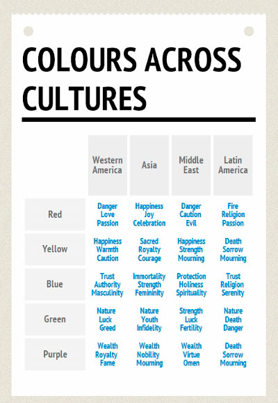
Image via GlobalMe
A great example of a company changing its colours to appeal to different global markets is McDonald’s across Europe where the iconic use of red has been substituted by green. Consumers in the European markets are on average more concerned with health and environmental issues when it came to consuming fast-food so to address this, many McDonald’s across Europe changed the famous golden arches logo to include green. They also modified the menu to offer healthier salad alternatives too.
Explaining this colour change in the Irish Times, one reporter stated, “Colour psychologists suggested that McDonald’s red was the most likely in the spectrum to stimulate heart rate and appetite – green, meanwhile, is viewed as the colour of hope, the ‘Barack Obama’ of the colour spectrum.” [3] This localised global colour brand strategy seems to have worked because McDonald’s currently earns more revenue from its Europe presence than compared the US, and there are more McDonald’s throughout Europe than any other fast-food chain.[4]
In most countries, blue creates a feeling of trust and professionalism, which is why many technology, insurance and finance companies utilize this colour. In fact, more companies use the colour blue for their brand than any other colour. According to a study by Interbrand, 33% of the world’s top brands use blue in their logo.[5] This can be seen with companies like GE, RBC, Citibank, Facebook, SAP, and many more. It’s also the colour that has the broadest appeal across the gender spectrum.
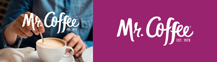
Image ©Mr. Coffee
Deep purple is often seen as the colour of royalty, creativity and magic. Recently, Mr.Coffee had a go at rebranding with this new colour to appeal to a younger audience. Research indicated that many Millennials viewed the Mr.Coffee brand as one more suited to their parents, and were frequently seen to buy their coffee out instead of making it at home. To expand their perceived brand relevance and capture the younger generation’s attention and sales, Mr.Coffee rebranded with the colour purple, as well as expanded their colour palette to include a variety of different colours. You can see their debut of this playful rebrand with their video below.
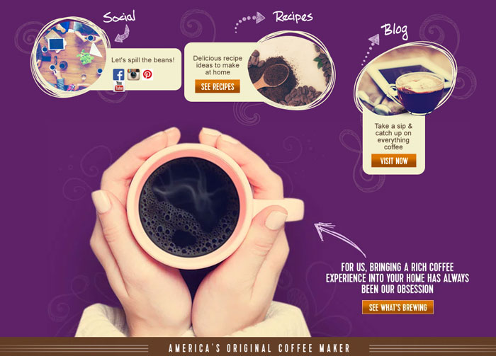
Image via ©Mr. Coffee
Yellow is incredibly vibrant and invokes a sense of energy and excitement. This colour is also proven to be very effective in point-of-sale messaging because it readily captures the eye. Perhaps the most iconic example of this is the premium champagne brand, Veuve Clicquot. Anyone can spot that yellow bottle from a mile away.
Related: Discover How to Use Brand Archetypes To Build Your Winning Brand
The audacious yellow has adorned these bottles for over 180 years when Madame Clicquot decided to distinguish the “dry” bottles from the usual sweeter ones. It was and still is a very successful brand. As they state on their website, “Our wines must be flattering both on the palate and on the eyes.” The strategy must be working for them, as they sell over 1.5 million cases of champagne every year.[6] If product marketing is key to your success, then it might pay to take a page out of Veuve Clicquot’s playbook.
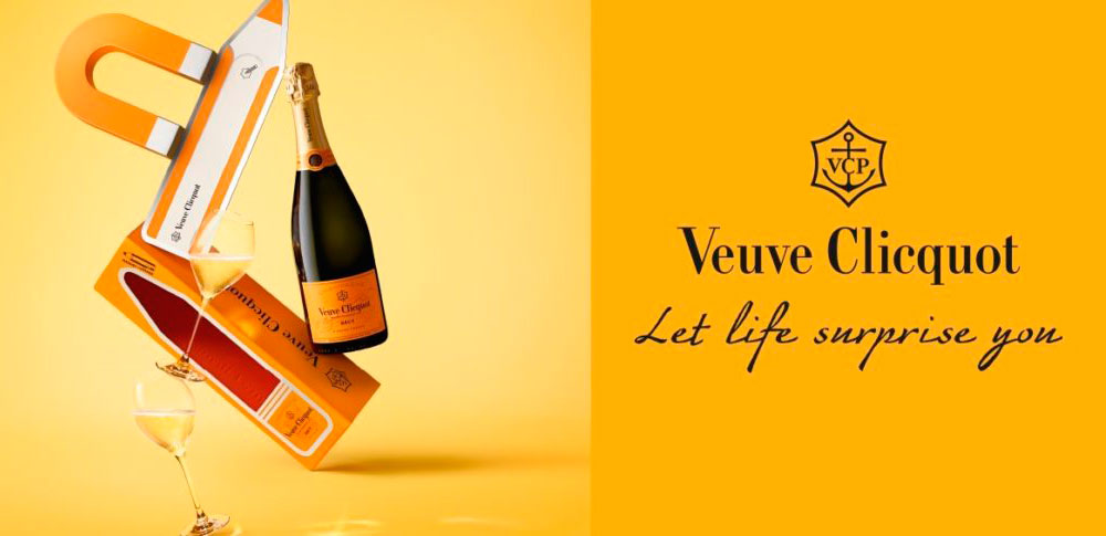
Image ©Veuve Clicquot
Are you a business leader, manager or entrepreneur who wants to re-evaluate or build your brand strategy so you can effectively leverage colour psychology to increase your sales? Are you curious about how to build or scale a highly successful standout brand? Join one of our branding workshops because they empower you to build your brand, enhance customer experience, expand your market impact and create higher perceived value so you can command a premium.
In fact, the Persona Brand Building Blueprint™ Mastermind is all about fast-tracking you, your brand and your business through the brand building, brand strategy process using big-brand know-how with proven systems that get results so you can grow your business faster and more effectively.
If you want a tailor-made solution specifically for your brand then we also provide in-house bespoke Persona Brand Building Blueprint™ Intensives working with you and your team so you can grow your business faster and more profitably. Contact us to discover more [email protected] or +353 1 8322724
Colour Psychology in Your Colour Branding Strategy
There are many different strategies used in branding that use colour psychology to help identify the right colour for your brand. It’s not unusual to have a dominant brand colour supported by one or two secondary colours. Each colour has a different subliminal message and so, influences customers’ choices differently. How many colours, and which colours you choose, are all important components of a well-informed brand strategy.
Related: 5 Red Flags That It’s Time For A Brand Audit Health Check
One Colour Branding Strategy
Many brands choose to leverage one strong colour in their brand strategy. This approach can be incredibly powerful. Out of the 100 companies that Forbes listed as the top-earning companies in the world, 41 of them employ a single-colour branding strategy. When choosing just one colour for your brand, it’s important to ensure that the colour and hue chosen speaks the visual language you want to use to influence customer perceptions — and expresses your brand’s personality.
Many big brands utilize a ‘one colour’ branding strategy including Facebook, Twitter, and Salesforce. The colours chosen are usually bold so that they are easily recognizable and readily associated with the brand. One example of an incredibly bold colour choice belongs to Deutsche Telekom, with their bright magenta brand colour.
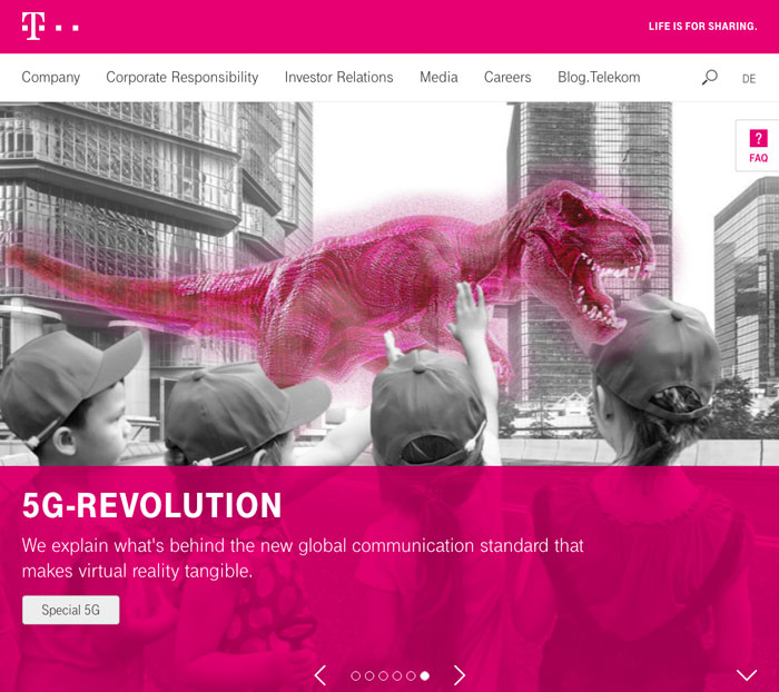
Image via © Deutsche Telekom
This colour enables them to stand out from other European telecom companies. They have also incorporated their brand colour into many creative marketing campaigns, including teaming up with the GORILLAZ to bring augmented-reality “magenta portals” all throughout Europe. Watch the video below to see the very effective colour branding strategy deployed.
Two Colour Branding Strategy
Frequently brands choose two colours because it can be more effective for relaying a more complex message than with just one colour. A great example of this is with the brand Lufthansa. This famous blue-yellow Lufthansa colour scheme was introduced by the German graphic designer Olt Aicher in the ’60s.
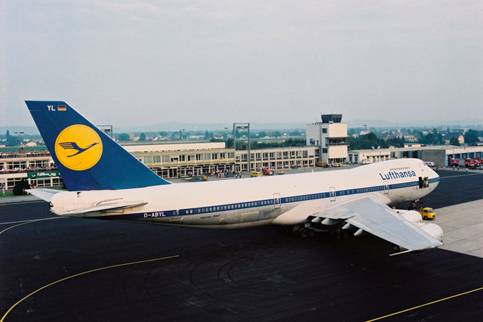
Image via ©Lufthansa (old brand identity before recent update)
To this day, this is considered one of the most successful rebrands of the 20th century. Aicher picked these colours for a number of reasons. “In yellow, he saw qualities such as speed, safety, freshness, agility, activity and engineering. Above all, he saw an opportunity to corner the market,” according to Designo.
Related: Design Is NOT Branding, 10 Things Every Business Owner and Entrepreneur Should Know
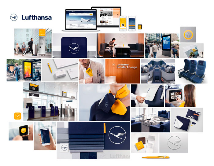
Image ©Lufthansa
It is true, that for many many years Lufthansa was the only airline that used the colour yellow in such a way. They were recognized globally for this colour combination and stood apart from their competitors. Nowadays, the two-toned colour scheme is utilized by Lufthansa in a different way. After a recent rebrand in 2018, Lufthansa has put their blue colour in the forefront, using the yellow as an accent to accentuate and draw attention to certain words or pieces of content.[10] Watch the following branding case study from Lufthansa to see how they evolved their brand and colour through months of discussions, collaborations and debates. This is a model to be considered for emulating any rebrand — meticulous and thoughtful, never rash.
Multi-Colour Branding Strategy
A trend in branding at present is the usage of a colour gradient or a few different colours that seamlessly blend into each other. We typically don’t recommend a brand identity being too heavily influenced by trends because, by their nature, they date more quickly. However, if your audience is a younger age profile and its appropriate to your product or service offering, then trend factors can be more important. If you have a younger target market, like Gen X’ers, then a colour gradient approach might be a useful and smart part of your colour brand strategy.
Related: Top 10 Branding Trends in 2019 Part 1
An example of a brand that utilizes a multi-colour strategy well is Instagram. Back in 2006, Instagram felt that their brand identity looked dated and they wanted to remain relevant with their younger target generations. As part of their rebranding strategy they changed their icon from a classic “film camera” look, to a gradient of blues, purples, pinks, and oranges. It obviously resonated, because since the rebrand in May of 2016, Instagram has almost doubled its users, from 500,000 to 1 billion + monthly active users.[11]
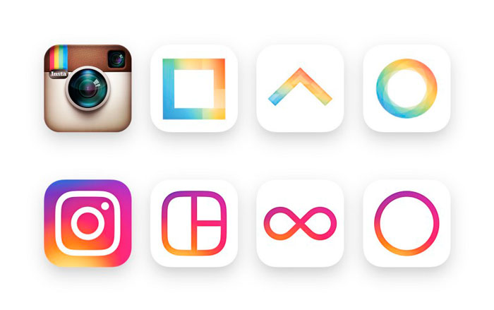
Image via ©Instagram
Related: Use Psychology in Your Brand Strategy to Create Irresistible Brand Experiences and Increase Sales
When Should You Change Your Colour Branding Strategy?
Any change to your company’s brand assets or visual identity should always be informed by a much larger branding strategy that has been well-researched and codified purposefully.
Changing your brand’s colour palette without serious strategic intent can have disastrous results. Most brands employ painstaking efforts to ensure that their organisation’s colour is appropriate and based on well-researched metrics and validation with customers. Google once tested 40 different shades of blue in its logo to see which one would perform best.[12] Using data from interactions on their homepage and Gmail page, they landed on the blue colour tone that statistically performed best — a blue that was “not too red, not too green”.[13]
However, there are times when changing your brand colour temporarily can be done without conducting a full rebrand or deep statistical study. These strategies can be used to create buzz and work well as interesting marketing strategies.
Celebrating a Cause with Colour Branding Strategy
Every October, you can expect to see a wave of pink hit your malls and screens. Many companies often change their brand colours to pink in this month out of solidarity with “Breast Cancer Awareness” Month. It’s not uncommon to see sports teams donning this pastel pink, or seeing pink-coloured products marketed in your grocery stores that benefit the cause.
Related: Female Power And The Growing Influence of Branding for Women
This kind of temporary rebrand is an honourable way to show that your company stands for something that matters, while simultaneously giving back. Beyond that, it can be good for business too. According to a recent study by the Shelton Group, 86% of consumers believe that companies should take a stand for social issues and 64% of those who said it’s ‘extremely important’ for a company to take a stand on a social issue said they were ‘very likely’ to purchase a product based on that commitment.[14]
Related: Social Responsibility, How to Build a Socially Conscious Brand
Celebrating a Milestone or Event Amplified by Colour Branding Strategy
There is a great example of a colour change to celebrate a milestone or event with Campbell’s Soup. To celebrate the 50th Anniversary of Andy Warhol’s painting “32 Campbell’s Soup Cans”, the soup company released four limited edition brightly coloured versions of their condensed tomato soup.
Obviously, switching the company’s brand colours on their packaging temporarily to commemorate this special day was a solid marketing and PR strategy. The cans were incredibly successful, even after the initial campaign. In Australia, these cans (a work of art – literally) became the latest craze in home decor. People started using these cans as planters and trinkets on their shelves and posting pictures on them on Facebook and Instagram, alike.
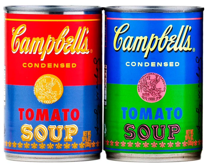
Image ©Campbell’s Soups
Another example of temporarily using new colours in a marketing campaign comes from Uber, with their release of Uber Beacon. The idea was that each driver for Uber would have a windshield light that would light the Uber logo up in whatever colour the Uber driver chose. The corresponding colour would show up on the passenger’s phone, allowing them to easily spot their driver. First of all, this was an incredibly practical solution for Uber customers in crowded cities like NYC. Secondly, the different colours allowed for individuality with the different drivers, and an exciting marketing campaign by Uber, overall. Watch the following video to see this campaign in action.
If you’d like to discover more about building and maintaining a thriving, high performing, highly profitable standout brand, then get in touch because we’d love to help you make your brand into a profit powerhouse.
- Schedule an appointment — we can meet in person or online
- Allow us to create a customised plan for you
- Let’s implement the plan together
- Contact us [email protected] or ring +353 1 8322724 (GMT Dublin/London time 9:00 – 17:30 weekdays)
Lorraine Carter is a branding expert and international speaker delivering talks that inspire and motivate along with masterclasses and workshops that inform and support transformational outcomes fast, and consultancy expertise that solves problems so you can outshine, outperform and leave your competitors way behind.
Final Thoughts
It goes without saying, that any change to your company’s brand colour should be underpinned with some serious thought, data-driven insights, and compliance within your larger brand strategy. Colour is something that everyone relates to on both a conscious and subconscious level.
The colour(s) that you choose to represent your brand are incredibly important because of how customers react to them consciously and unconsciously — all of which influences sales — so choose wisely (and never on subjective personal preferences).
Questions to Consider
- What is your current colour brand strategy?
- What emotions do your brand’s colours evoke?
- What kind of emotions would you LIKE your brand to evoke?
- Are your colours well-received in ALL of your global markets?
- Is your brand colour informed by your larger branding strategy?
- Is there room to improve in your colour and brand strategy?
- Are there any events, campaigns, or interests that could qualify temporarily changing your brand’s colours in a marketing campaign?
- If you think your brand needs a new colour as part of a rebrand or brand refresh, what are your reasonings?
Your Persona Client Satisfaction Guarantee
- When you work with us we’ll create a customised brand building plan and strategy with clear investment for you tailored to your specific requirements and preferences
- You’ll know each step of your brand building journey before we start because we’ll discuss it, document it and agree on it with you before work commences
- You’ll have timelines, key milestones and deliverables to evaluate and approve for each stage and part of your brand building process
- Because we know the unexpected sometimes happens we can make adjustments along the way if you need it and if something extra is requested we’ll ensure you’re fully appraised about what that entails before committing
- As we achieve pre-agreed objectives you’ll be able to evaluate your brand building work and strategy in progress, coupled with the outcomes to ensure return on investment
Get in touch today because we’d love to get started helping you build your standout, powerhouse brand so you can increase your profits and leave your competitors way behind.
Email us [email protected] or ring us +35318322724 (GMT 9:00-17:30) and ask about our VIP Brand Strategy Discovery.
References
- https://www.entrepreneur.com/article/233843
- https://www.businessinsider.com/these-23-brands-are-using-colors-in-their-logos-to-influence-customers-2017-3
- https://www.cbsnews.com/news/mcdonalds-changes-color-scheme-of-iconic-arches/
- https://www.investopedia.com/articles/markets-economy/091716/10-countries-most-mcdonalds-locations-mcd.asp
- http://designbuddy.com/what-do-worlds-top-brands-logos-have-in-common
- https://vinepair.com/articles/13-facts-veuve-clicquot-champagne/
- https://blog.designcrowd.com/article/774/41-of-the-worlds-most-successful-brands-use-a-single-color-in-their-famous-logo-design
- https://www.businessinsider.com/these-23-brands-are-using-colors-in-their-logos-to-influence-customers-2017-3
- https://www.disegnodaily.com/article/what-s-in-a-colour-lufthansa-yellow#prev
- https://www.underconsideration.com/brandnew/archives/new-logo-identity-and-livery-for-lufthansa-done-in-house.php
- https://www.statista.com/chart/9157/instagram-monthly-active-users/
- https://www.businessinsider.com/these-23-brands-are-using-colors-in-their-logos-to-influence-customers-2017-3
- https://www.fastcompany.com/1403230/googles-marissa-mayer-assaults-designers-data
- https://engageforgood.com/guides/statistics-every-cause-marketer-should-know/
- https://www.business2community.com/branding/when-is-it-ok-to-mess-with-your-brands-color-0268243

