Colour Psychology: Cracking the Colour Code for Profitable Branding
Colour is incredible! From rainbows to coral reefs and from bluejays to goldfish, throughout the natural world, the phenomenon that we call colour is a vital source of stimulation and communication.

When translated to the human sphere, its enormous power adds huge impact to communications, opinions, recall and emotional connections. In fact when used correctly, colour can be used as a pivotal tool to substantially influence purchasing decisions, be it product or service.
Leveraging Your Brand with an Exciting Red or a Trustworthy Blue
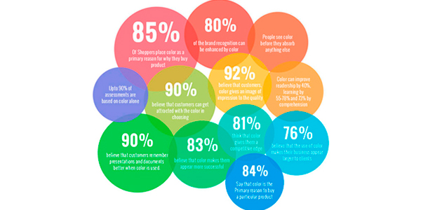
According to research from Canada’s University of Winnepeg, “Impact of Color on Marketing”, people make a subconscious judgement within 90 seconds of their initial viewing, and that up to 90 percent of the assessment is based on colours alone. [1]
“Exciting Red and Competent Blue”, published by the Journal of the Academy of Marketing Science, explains that colours influence how consumers view the personality of brands, looking at the impact on purchase intent. [2]
The University of Loyola, Maryland, reveals that colour increases brand recognition by up to 80 percent, while KISSmetrics says, “85 percent of shoppers place colour as a primary reason when they buy a particular product.” [3]
Studies done by the internationally recognized Pantone Color Institute® indicate that “consumers are up to 78% more likely to remember a word or phrase printed in color than in black and white.” [4] They cite that colour combined with text, as in a logo, impacts readers with the trifecta of getting better recall, recognition and attention — all good news for the brand story.

Creative Violet, Peaceful Green and Bold Red
Certainly, nobody would have thought to suggest to masters like Paul Gauguin and Vincent Van Gogh that colours don’t really matter much. Mark Rothko’s canvases, devoid of subject matter, convey their message solely through powerful use of colour, such that “Violet, Green and Red” (1951) was worth $186 million just 63 years after the canvas paint dried.

“Violet, Green and Red” – Mark Rothko, 1951, Wikimedia Commons, public domain
We know that colour is important in our daily lives. We live in a world of colour. Comments such as, “What colour eyes does the baby have?” and “Let’s buy a red car” or “That shade looks good on you” are commonplace statements. Most of us have favourite colours and feel better when we wear them.
What most of us don’t realise is how much impact colour has on all of us subconsciously, or how much it can be used to influence us in the hands of a knowledgeable master.
World Authority on Colour
Pantone® is the world authority on colour. Each December, their U.S.-based Pantone Color Institute issues a hotly-awaited Pantone Colour of the Year, meant to influence fashion runway collections, interior decor and yes, even car manufacturers. In 2015, for example, “a naturally robust and earthy wine red” called Marsala (#18-1438, to be precise) got the annual nod as top pick for stylish nail lacquer, neckties, table napkins, wall paint and more.
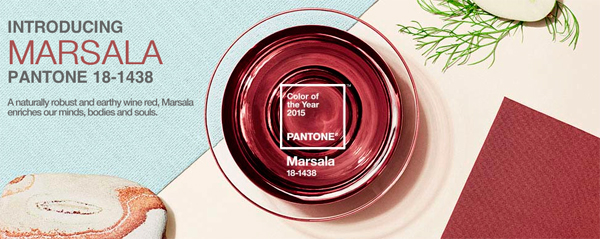
Image via www.pantone.com, Marsala 2015 Color of the Year – Pantone®
Colour Strategy in Brand Success
But, your company logo and your product line is far more complex than an accessory. Clearly, when a company manufactures products, designs a brand logo, buys staff uniforms, develops new packaging designs and invests in advertising, there will be no opportunity for a 12-month cycle to accommodate trend-setting changes.
Choosing a business brand palette is not about a designer’s preference, your favourite colours or anyone else’s. Brand colour choices are long-term decisions and it’s a critical identifier and influencer on the perception and personality of your brand. Colour is also widely credited with influencing purchase decisions.
Case-in-point, most people know where this box comes from even without seeing the sterling silver jewellery it contains. Somehow, it wouldn’t quite do if the box were red.

Image via www.tiffany.com
The colour wheel makes your business go round and round. It speaks to your customers. It differentiates you from your competitors. It is bold and discreet at the same time. It’s interactive.

Image via www.pantone.com
Change a signature brand colour and you’ll see how wrong it can feel:

Image via Fast Company Design, Paula Rupolo: Starbucks / Dunkin Donuts
It’s worth noting that Harley-Davidson is aiming to grow their 12 percent female market share with a sleek black model, not a sparkly pink one.

Image via www.harley-davidson.com
London-based colour and design consultant Karen Haller says, “When you use the right tonal harmonious colours, your brand’s message is communicated quicker to the brain than words or shapes as they work directly on our feelings and emotions.”
It doesn’t have to be beige.
Test yourself. We’ve scrambled the colours, their interpretation and one famous example of use in branding. Can you make 10 proper pairings? (Answers are found at the bottom of this post.)

Colour Strategy at Top Brands
Apple
Apple brought colour into a marketplace where colour had not been seen before. Steve Jobs introduced colourful iMacs in tangerine, blueberry, grape, strawberry, and lime followed by indigo, flower power, and blue Dalmatian. By the summer of 2000, the first snow white iMac was a thing of beauty. [5]
Apple was the first to say about computers, “It doesn’t have to be beige” — in the course of which brand packaging helped the company recover from a two-year loss of $1.8 billion to become the world’s largest public company, top in tech and the most valuable brand on earth. [6]

Image via www.apple.com
Heinz
Ketchup is red, right? Unless it’s green. Heinz sold more than 10 million bottles of its EZ Squirt Blastin’ Green Ketchup in the first seven months following its introduction in 2000 — because kids wanted it. That’s $23 million in green ketchup sales because of a simple colour change.

Image via www.fastcodesign.com, Heinz
And then, they over did it somewhat by introducing purple, pink, orange, blue and a rainbow mystery colour. No quite so appetite appealing! Mums hated it, especially when kids mixed them together on the dinner plate. Some 25 million bottles later, the party was over and all but the original were withdrawn. Colour matters and ketchup is red again.
Coca-Cola
Bright red with elegant white script, the best known logo in the world is considered to be Coca-Cola, which is little changed since 1887. When, in the mid-1980s, Coca-Cola made their first product taste change in a century, they also changed the cans’ packaging design to emblazon them with Coke lettering. They wish they hadn’t. Within three months, Classic Coke was back on the shelves as Coca-Cola. Brand marketers say it was a classic mistake to mess with Coca-Cola’s iconic red and white brand packaging design.

Image via Wikimedia Commons, public domain, Coca-Cola
McDonald’s
Where can you go without running into the Golden Arches? McDonald’s introduced them in 1960 to be seen towering above roadside establishments as America took to the nation’s newly-built highways. Why are the arches golden yellow? See how they stand out in this photo of McDonald’s logo seen against the blue sky. The arches rise from a field of red, very much considered the colour of choice for fast food brands including KFC, Wendy’s, Burger King, Pizza Hut, Domino’s Pizza and more. That’s it…a simple ‘M’ shape with happy yellow and energetic red, meaning “Stop here now”.

Image via Wikimedia Commons, public domain, McDonald’s
While colour preferences are personal, it’s universally understood that yellow means sunny and happy, while red translates as fiery and attention-grabbing. Whether a message is transmitted subliminally or overtly, the importance of colour in brand strategy cannot be overstated.
Since colour choices impact every aspect of a commercial enterprise, brand owners should aggressively re-evaluate that choice throughout their brand’s strategy, logo, brand collateral, packaging design, web design, product development, advertising and so on. Has your brand’s colour palette been selected with the right intent and applied to best possible effect? We’re here to help ensure that the answer is emphatically “yes”.

What do you think about the use of colour in branding?
- Are you convinced that colour selection in logo design significantly impacts brand identity and consumer perceptions?
- Would you like to know more about how colour selection makes a significant difference in consumers’ intent to purchase?
- Do you suppose that consumers (or just designers) are influenced by Pantone’s Color of the Year?
- On brand design, have you considered whether your brand’s colour palette is a good fit with your product or service?
- Have you experimented with colour innovation in your brand logo, brand packaging, brand collateral or company premises?
- How did you score on the answers to the colour matching quiz for brands?
Answers:
Yellow = Optimistic, positive, cheerful / Veuve Cliquot e.g. Cara Matches
Blue = Trustworthy, dependable / Facebook e.g. Wavin
White = Simplicity, purity / Apple
Green = Growth, freshness, natural / Starbucks e.g. Connemara
Pink = Youthful, energetic, playful / T-Mobile e.g. O’Egg White Eggs
Brown = Honest, simple, down-to-earth / M&Ms e.g. McConnell’s Gourmet Smoked Foods
Purple = Nostalgic, royal, sophisticated / Cadbury e.g. Massey Bros.
Black = Elegant, luxurious / Guinness e.g. La Moulière
Orange = Trendy, fun, approachable / Easy Jet
Red = Bold, powerful, exciting / Coca-Cola e.g. Tilley’s Confectionary
[1] http://www.emeraldinsight.com/doi/abs/10.1108/00251740610673332#
[2] ink.springer.com/article/10.1007%2Fs11747-010-0245-y
[3] https://blog.kissmetrics.com/color-psychology
[4] http://www.pantone.com/pci
[5] http://lowendmac.com/2005/which-imac-is-it-low-end-mac-guide-to-g3-imacs
[6] http://www.telegraph.co.uk/finance/globalbusiness/10002790/The-worlds-biggest-companies.html?frame=3293648
Leave a Reply
Want to join the discussion?Feel free to contribute!